
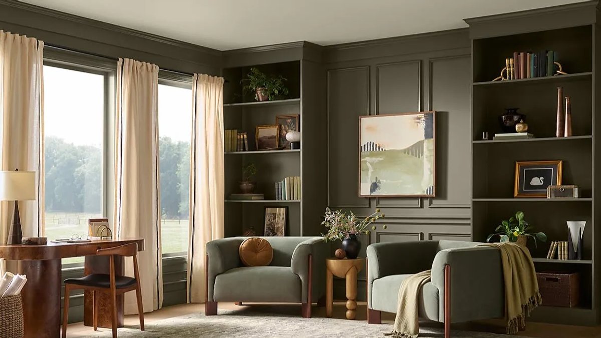
The paint colors of the year for 2027 take a different approach, focusing on emotional intent rather than a single dominant hue. While blues and greens remain present, the palette widens significantly, reflecting a shift towards personalization and self-expression.
Lisbeth Parada, color marketing manager for Dutch Boy and Minwax, states, “Color has always been tied to emotion.” This year’s selections aim to provide a digital detox, encourage authenticity, and offer opportunities for stillness and reflection.
A Shift Towards Emotional Connection
Phillipa Radon, an interior designer and C2 paint color specialist, observes that people seek to reconnect with their instincts and tangible experiences in a world dominated by technology and constant information. The 2027 color trends emphasize the need for recharging, not just retreating, to manage the fast pace of modern life.
In new-construction homes, color choice becomes particularly important. Paint serves as a powerful tool to personalize and support an emotional connection to a brand-new space.
BEHR’s Grounded: A Mossy Green Invitation
BEHR‘s 2027 Color of the Year, Grounded, is a mossy green with a name inviting you to breathe and return to basics. Kayla Kratz, head of color at BEHR, explains that Grounded balances the desire for calm and a sense of life within the home.
The color‘s moss and olive tones bring natural vitality, while its warm brown undertones add depth and steadiness. Kratz notes that Grounded mimics the ever-changing greens of a forest, transforming throughout the day with shifting light conditions.
Other notable colors include Deep Rooted by Dutch Boy Paints, a warm orange promoting strength and stillness, and Artifact by Pittsburgh Paints and Glidden Brands, a smoky blue encouraging pause and recalibration.
Sherwin-Williams introduces Celery, a light green with yellow undertones, signaling a move towards more expressive and optimistic colors.
Benjamin Moore opts for timelessness with Webster Green, a classic forest green, while Dunn-Edwards presents French Press Coffee, a rich brown with plum undertones that enriches daily routines.
Valspar revisits the spa-inspired calm of 2023 with Cottage Door, a mid-toned blue with warm undertones, reflecting a practical approach to home design. These colors highlight trends towards personalization, emotional connection, and a desire for balance and rejuvenation within the home.
Emotional Impact Through Color Complexity
Artifact by Pittsburgh Paints and Glidden Brands is a smoky, atmospheric blue designed to create space for pause and clear thinking. Its name reflects the rarity and value of such moments. The color also embodies the idea that significant change can come from subtle adjustments rather than complete overhauls. As a mid-tone blue, it balances warmth and depth, offering both focus and comfort. This subtle shade is felt before it is seen, making it ideal for homeowners seeking emotional impact.
Pueblo by C2 is a warm, muted rose that resists simple categorization. Its identity shifts with natural light, blending deep floral tones and earthy neutrals. This complexity adds dimension to interiors, making the color an active part of the living experience. Phillipa Radon notes that Pueblo reflects creativity and movement, encouraging a digital detox. Its dynamic nature suggests a shift toward using homes as spaces for individuality and renewed engagement.
Its multidimensional quality adds visual interest while remaining versatile. Lauren Hoferkamp explains that the color reveals itself gradually, with its plum undertones emerging as light changes throughout the day. This grounding yet character-rich shade provides a restrained elegance, making it suitable for various applications.
The Role of Color Names in Shaping Experience
Paint color names have become integral to the overall experience, with brands carefully selecting names that evoke specific emotions and connections.
For example, Deep Rooted by Dutch Boy Paints not only reflects its nature-inspired warm orange but also conveys a sense of grounding and openness to possibility. Lisbeth Parada notes that the name captures the color’s ability to provide strength and stillness in a fast-paced world.
Its name suggests a treasured and rare moment of pause and recalibration. Ashley McCollum emphasizes that the name reflects the color’s role in helping homeowners unwind and feel grounded.
Timelessness and Sustainability in Color Choices
Benjamin Moore’s Webster Green exemplifies a shift towards timelessness and sustainability in color choices. As a classic forest green, it offers a durable yet stylish option for homeowners seeking long-lasting appeal.
Dunn-Edwards’ French Press Coffee also reflects this trend, offering a complex hue that adds visual interest without being overly trendy. Lauren Hoferkamp notes that its subtle plum undertones emerge gradually, providing a grounding and restrained character that endures over time.
Sue Kim describes it as a thoughtful and grounding color that creates a sense of security and trust. This practical approach to home design resonates with consumers seeking colors that endure and adapt to their evolving needs, making Cottage Door a practical and welcoming choice for real-life spaces.


