
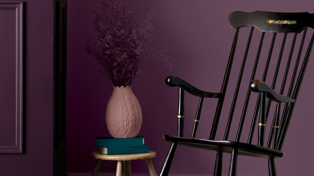
Color drenching—applying a single hue to walls, ceilings, and trim—has transitioned from European design studios into Canadian homes, delivering a striking yet unified visual impact. Contrary to the widespread belief that dark tones shrink a room, this method actually enhances spatial perception, making areas feel more expansive and engaging. BeautiTone’s 2025 Color of the Year, Midnight Flora, exemplifies this principle with its deep red-blue fusion, which complements furnishings while preserving an air of refinement.
Effective implementation requires restraint. Instead of introducing conflicting patterns or furnishings, the technique relies on the paint itself as the centerpiece. For instance, a gray sofa combined with taupe and brown accents can soften an intense wall color without diminishing its presence. The outcome is a deliberate, cohesive arrangement that aligns with contemporary tastes while feeling intentional.
Homeowners wary of full commitment can integrate the approach gradually. Gray, the dominant neutral of the past ten years, doesn’t need removal—it can serve as a stable base while bold walls introduce modern energy. Pairing deep wall shades with natural wood, plush textiles, and metallic details creates striking contrast without visual conflict, merging opulence with organic textures.
For those preferring a less intense version of Midnight Flora, two curated palettes offer alternatives. A pairing with Stillness, a muted blue-green, softens the richness for a more restrained elegance. Alternatively, combining it with Bloom and Afterglow introduces warmth, making it ideal for bedrooms or living spaces where comfort is prioritized.
Why Paint Quality Makes or Breaks the Look
The method’s effectiveness hinges on product quality. BeautiTone’s Designer Series, manufactured in Canada, features durability-enhancing properties: anti-scuff formulation, simplified application via Duralink technology, and wear resistance. Its ceramic microspheres deliver a flawless finish even on uneven surfaces, though meticulous wall preparation, including thorough cleaning, remains critical.
This design approach reflects a broader movement toward immersive interiors, where color shapes the environment rather than merely framing it. Unlike temporary trends, color drenching accommodates diverse styles, from bold statements to understated layering. Its adaptability positions it as a sustainable choice for homeowners open to experimentation.
Related Post: Experts share simple dining room design ideas
Newcomers to the trend can ease in with a single accent wall, minimizing risk while exploring possibilities. The core principle centers on equilibrium: allowing the chosen hue to dominate while surrounding it with complementary textures and objects that reinforce rather than clash with its impact. In a market still favoring neutral tones, this method offers a revitalizing departure without compromising comfort.
How a Single Color Can Redefine a Space
Midnight Flora’s prominence in Canada signals a growing preference for deliberate, high-impact design over conventional palettes. Whether executed in its original form or adapted with softer hues, the technique demonstrates that depth, both visually and emotionally, can arise from a single, thoughtfully selected color.
Looking ahead, industry analysts project that by 2027, color drenching will account for 15% of all residential paint sales in Canada, up from 8% in 2024.
For those inspired to try the method, experts advise starting with a high-traffic area where the impact can be easily assessed. Bathrooms, which see frequent updates, are ideal test cases.
Ultimately, color drenching’s endurance lies in its versatility. Whether applied to a single statement wall or across an entire home, the technique adapts to individual tastes while delivering a transformative effect. Its rise in Canada reflects a cultural shift toward design that is both bold and intentional, a departure from the neutral dominance of previous decades.


